 Texts
Texts Buttons
 Menus
Menus Sliders
 Backgrounds
 Cursors
 Medias
 Cores
Cores
 Beginner /
  Light
LightDistorsion Tabs
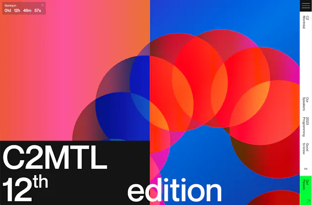

How it works
Distorsion Tabs is a nestable block element made of a Nav element that contains the Nav Items (you can put any elements here) and a Tabs element that contains the Tab Items (you put the content you need at each Tab). The number of Nav Items should be equal to the Tab Items. The first Nav Item will trigger the first Tab, the second Nav Item will trigger the second Tab and so on.
In case you want to put the Distorsion Tabs vertically, so that the Nav is above the Tabs, you can just change the flex direction to be a column at the Style Tab.
Settings
Active Tab: the Active Tab by default when the page loads.
Event: When to trigger the tabs at Nav Items. Hover or Click.
Tabs Elements Dimensions
Each Tab has an absolute position required for the distorsion animation to work properly. So you should give defined dimensions to Tabs using Width and Height at this section.
Distorsion Animation
Duration
GSAP easing: you can choose from a wide variety of easings. Learn more about GSAP easings here.
Nav Items Fade Animation
Opacity: the opacity value when the Nav Items are inactive.
Opacity Duration
Opacity CSS easing: you can set any custom CSS easing of your own. Learn more about CSS easings here.
– Tamu