 Texts
Texts Buttons
 Menus
Menus Sliders
 Backgrounds
 Cursors
 Medias
 Cores
Cores
 Intermediate /
  Light
LightAnimator
How it works
Animator is a complete integration of the popular GSAP library, including ScrollTrigger and upcoming plugins from GSAP’s environment like SplitText.
Although it is not a must to use Animator, it is highly recommended to understand how GSAP works, at least it’s basics, in order to design animations at Animator with ease.
You can learn more about GSAP here.
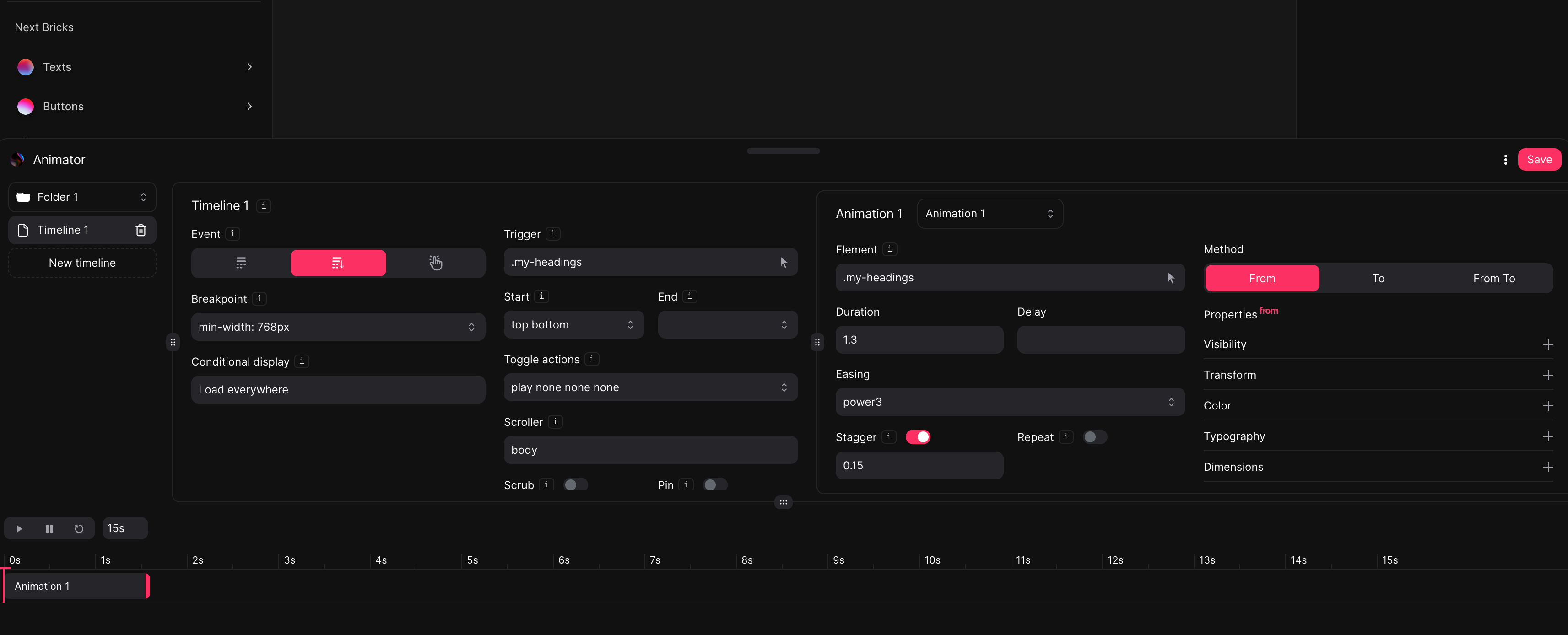
Animator is made of folders. Folders are made of Timelines and Timelines are made of Animations.
Folders are just items to group our Timelines, they don’t play a role when animating.
Timelines are timelines and Animations are tweens.
In order to resize Animator and fit properties at your screen at pleasure, you can use all the resizers available at Animator. When saving, resizers will also do.
Animator controls
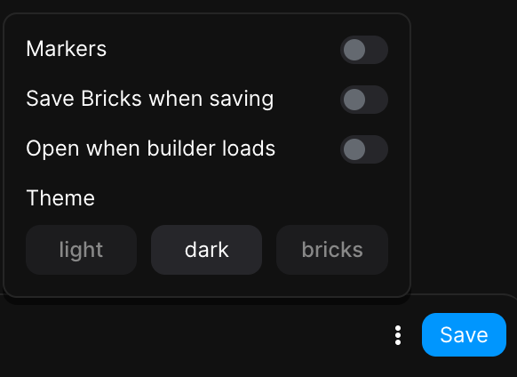
Markers: if enabled, all timeline markers will display, but only at the front.
Save Bricks when saving: if enabled, Bricks Builder will also save when saving Animator.
Open when builder loads: if enabled, Animator will toggle automatically when builder loads.
Theme: to set a palette theme, just like at Next UI. You won’t need to save as the theme switch will be saved automatically.
Timeline controls
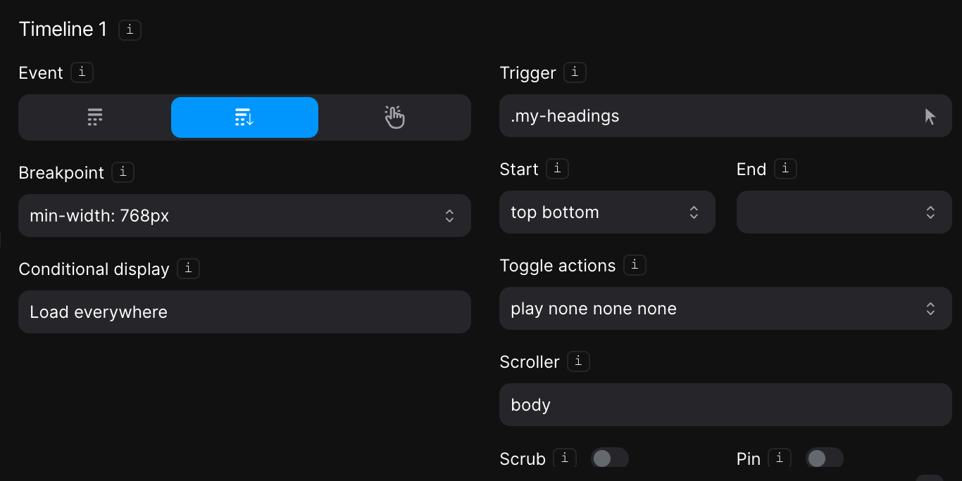
Timeline: a Timeline is a powerful sequencing tool that acts as a container for animations
Event: the trigger action that will fire the animations: page load, on scroll or custom user events. Depending on the event selected, properties will be available or not.
Breakpoint: determines at what viewport width to include the timeline. Leave empty to load the timeline at all viewports.
Conditional display: if the timeline has to be included only at specific pages (passed by ID). e.g: 39, 75
Trigger: the element that will trigger the animations when the selected event occurs. A timeline can only have one single element as a trigger, so setting a selector shared by multiple elements will result in multiple timelines.
Scroll event controls:
Start: top bottom means the animations will start when the top of the trigger hits the bottom of the viewport.
End: top bottom means the animations will end when the top of the trigger hits the bottom of the viewport.
Toggle actions: determines how the timeline is controlled at the 4 toggle places – onEnter, onLeave, onEnterBack, and onLeaveBack, in that order.
Scroller: it’s the element whose scrollbar is linked to the timeline.
Scrub: links the progress of the animation directly to the scrollbar so it acts like a scrubber.
Pin: an element that should be pinned during the time that the timeline is active. Use ‘this’ to pin the trigger.
Custom event controls:
Reverse: reverses the timeline so that all settings and properties of the animations are oriented backwards
Restart: restarts the timeline and begins playing forward all settings and properties from the beginning.
Animation controls
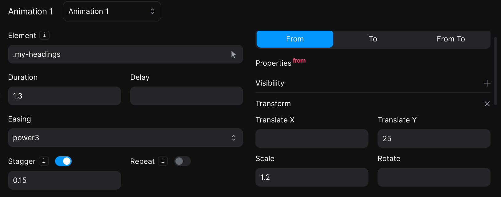
Element: the element that will receive the animation. Use ‘this’ to apply the animation to the element that triggers the timeline.
Stagger: to set an animation delay between elements with the same selector.
Repeat: the number of times that the animation should repeat after its first iteration.
Yoyo: causes the tween to go back and forth, alternating backward and forward on each repeat.
Method: From, To or From To:
From: the properties from which the element will come from.
NOTE: because GSAP is a Javascript library, you may notice flickering when applying a from property to an element. In this case, it is better to apply a from property manually at the element and animate it to any value you want to. If you want to keep using from method then you should apply a fade to a parent element using Javascript to avoid the flickering.
To: the properties the element will go to.
From To: Both from and to methods combined.
Timeline view controls
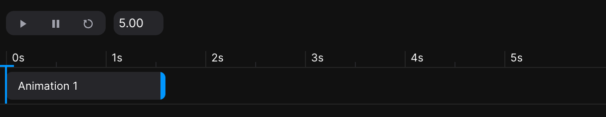
Timeline view is to reproduce animations. You can change timeline duration markers at pleasure.
Timeline view will display all the animations available at the active timeline, but only when the element selected exists.
All animation fragments can be dragged and resized, modifying their delay and duration respectively.
Dashboard customizations
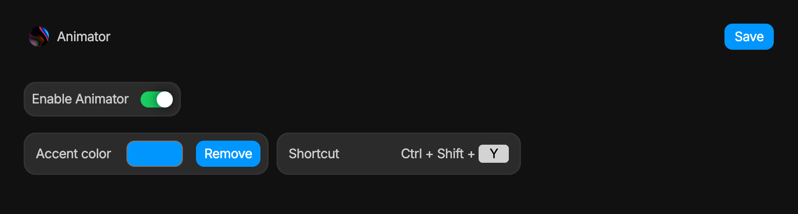
Accent color: the image below is what Animator would look like if Accent color is changed to #FD3063 (Magenta).
All Accent colors will be changed by the one set. Make sure that you choose a legible color as it will combine with white texts.
Shortcut: the command that will toggle (open/close) Animator right at the builder.
– Tamu